If you arrive on this post by a direct link or from Google, I suggest you to read the last two posts on the 30days startup challenge : here and here.
Now, let’s go to the main topic of my article : how to design a logo for the startup. Well, it’s not going to be a nice tutorial like the ones you can find on Smashing Magazine. Here I won’t give you any method, just some tools I used to design my logo.
The font
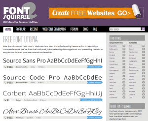
According to me, the font of a logo is a really important signal to express what is the “character” of the company. To find your ideal font there is one resource you should use : Font Squirrel Font. It allows you to preview your text in different font and download them. They have only free fonts that are licensed for commercial work. So far so good right? The nice thing is also they have a nice classification system which allows to find what you need easily.
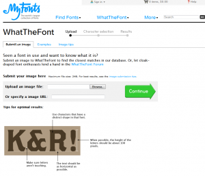
What The Font is a very useful service if you like a font you have seen somewhere on the web, and want to know what font is used. I wanted to keep my font secret, and let you use What The Font service to discover it… but unfortunately WTF does not work for my logo (it is a bit modified).
Graphical Elements
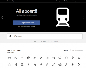
Sometimes you need to add some graphical elements to your logo, like a flower or anything simple. For this, you have the main tool called The Noun Project.
Designing the final logo
To design the logo which should represent WordiZ, I used the free software Inkscape. It is a vectorial designing tool, so that you can create strange shapes, play with points on their path, and zoom without quality loss.
To understand the logo (see below), I have to give you what designers call a “design brief” (I may be wrong on the term, please correct me if necessary). The letter ‘W’ has three increasing steps. It represents the search engine ranking positions (SERP) of our customers. By using our service, their position on Google will increase. It could also be related to any measure of success for their business (clients, buzz, etc.). The colors have been chosen to appear soft and smooth but also clear and elegant. The final letter, in opposition, is there to increase the impact of the name. The pencil at the end is representing the action of “writing” which is the core product that our startup will offer. What do you think about it?
Sorry to put the social toll; but by clicking it you will help WordiZ before its even officially released. Great isn’t it?
![]()
? Inspiration for your logo
I found useful, during my reflexion about my logo, to get some inspiration elsewhere. I can recommand you to browse Pinterest and use some keywords to find what you need. One website which helped me was ABDUZEEDO and their inspriation/logo section. Have a look, you might get inspired.
Do you have any other ideas for logos? Just drop a comment below.